You have different packaging for different products, you wouldn’t put headache pills in a crisp packet for example. Packaging has to be fit for purpose, to get the manufacturers new big thing into your hands intact and with enough info that you know what to do (and not to do) with it.
It’s also there to promote brand identity, the success of your following produce may have everything to do with people recognising your produce as being part of a brand that they like or trust. This is just for fun, a bit of a satirical look at the difference between Apple and Microsoft’s style of packaging:
So, lets have a look at some packaging ![]()
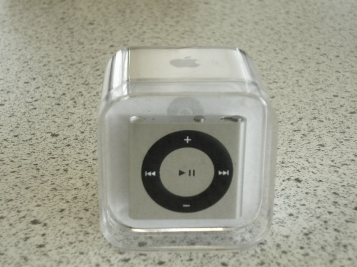
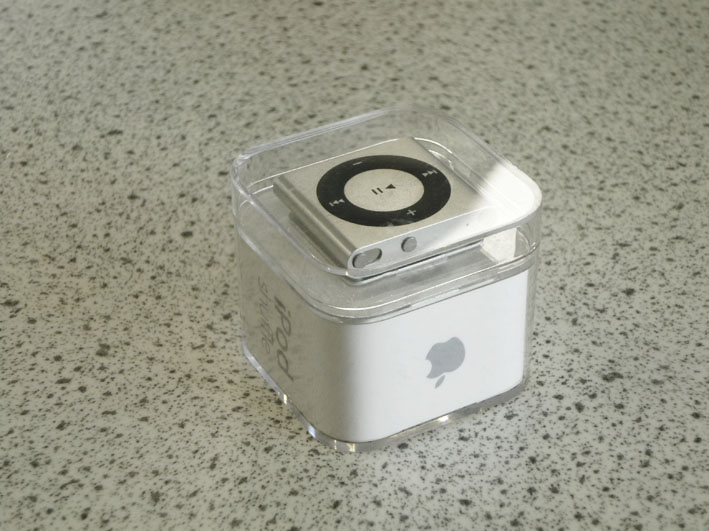
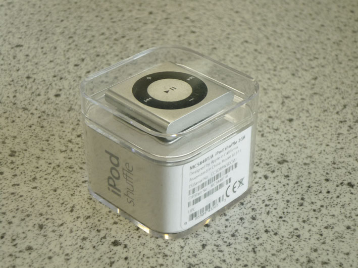
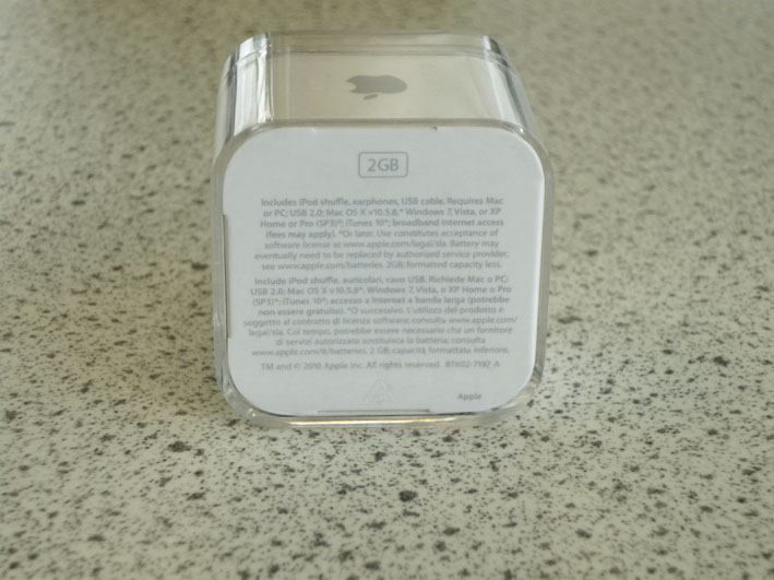
Ah, apple, you may have had some recent hiccups with the release of the iPhone 4 but no one can fault your packaging design. It’s a beautiful plastic box with apples trademark white card with gray text. It clearly displays the product, allowing you to see it’s main selling points: it’s size and how thin it is. Speaking of size there really is no space wasted in this packaging. It fit’s in the palm of your hand and everything is secure, no rattling around. It’s clearly marked with the company logo, the product name, the design and manufacture origins, safety mark and product serial numbers around the boxes circumference. On the bottom of the box the contents are clearly laid out along with the system requirements in English and Italian and a reiteration of the memory of the product. I personally love this design, it’s simple clean and reflects the shape and styling of the product itself.
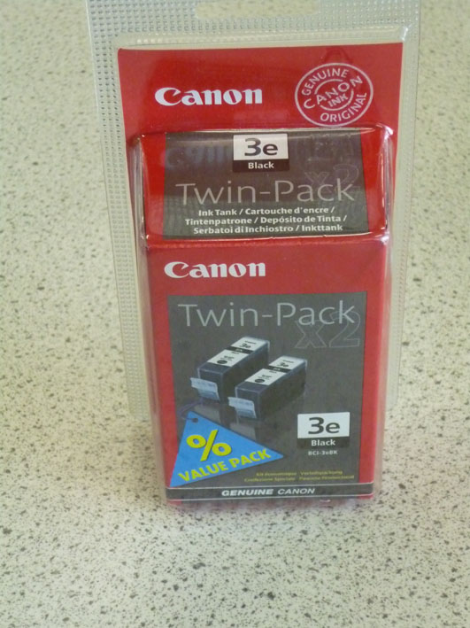
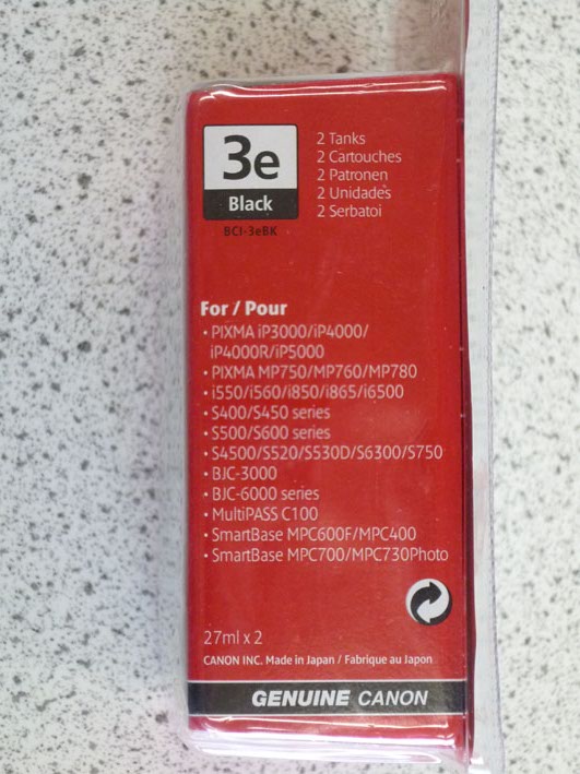
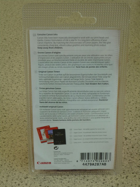
these ink cartridges are packaged in, what looks like a vac formed plastic case heat sealed at the edges. It displays the company name and a stamp that assures the customer that it is a genuine Canon ink product. The product is completely encased in a cardboard inner sleeve so you can’t see it at all, a photograph depicts it along with the cartridge code. It’s labeled as a twin pack and this is emphasised by the use of the ‘value pack’ label. the side of the package lists the printers that the cartridges are compatible with and also (Not shown above) it’s maximum and minimum operating temperatures. The back of the pack has some blurb about how Canon inks are specially formulated for their machines in 5 different languages plus an advert for their photo paper. I’m not a great fan of this packaging as the product rattles around in about twice as much space as it needs. The technical information is clear but the colours and massive mix of fonts and font sizes is off putting.
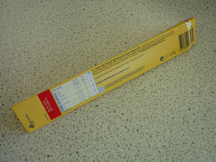
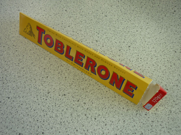
Before you think it I did not eat the whole of this Toblerone by myself!! The shape of the packaging is a reflection of the shape of the product and is also reminiscent of the products logo of a Swiss Alp. It has a description of the chocolate and the country of origin on two sides of the box along with the product name. The weight and calorific values are printed on a red band next to the tear round strip that gives the consumer access to the product. All the detailed product info is on the bottom of the box, the ingredients, nutritional value, GDAs and the use by date. I love this box, possibly because it’s my mum’s favorite chocolate and I have some good memories attached to it ![]()
